Jak to zrobić — odwrócić obraz
Dowiedz się, jak odwrócić obraz (dodać efekt lustra) za pomocą CSS.
Najedź myszą na obraz:
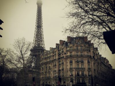
Jak odwrócić obraz
Przykład
<style>
img:hover {
-webkit-transform: scaleX(-1);
transform: scaleX(-1);
}
</style>
<img src="paris.jpg"
alt="Paris">
Uwaga: ten przykład nie działa na tabletach ani telefonach komórkowych.
Wskazówka: przejdź do naszego samouczka CSS 3D Transforms , aby dowiedzieć się więcej o transformacjach 3D.
Odwróć obraz 3D z tekstem
Dowiedz się, jak wykonać animowane odwrócenie obrazu 3D z tekstem:
Paryż
Co za niesamowite miasto?
Krok 1) Dodaj kod HTML:
Przykład
<div class="flip-box">
<div class="flip-box-inner">
<div class="flip-box-front">
<img src="img_paris.jpg"
alt="Paris" style="width:300px;height:200px">
</div>
<div
class="flip-box-back">
<h2>Paris</h2>
<p>What an amazing city</p>
</div>
</div>
</div>
Krok 2) Dodaj CSS:
Przykład
/* The flip box container - set the width and height to whatever you want. We
have added the border property to demonstrate that the flip itself goes out of
the box on hover (remove perspective if you don't want the 3D effect */
.flip-box {
background-color: transparent;
width: 300px;
height: 200px;
border: 1px solid #f1f1f1;
perspective:
1000px; /* Remove this if you don't want the 3D effect */
}
/* This
container is needed to position the front and back side */
.flip-box-inner {
position: relative;
width: 100%;
height: 100%;
text-align: center;
transition: transform
0.8s;
transform-style: preserve-3d;
}
/* Do an horizontal
flip when you move the mouse over the flip box container */
.flip-box:hover .flip-box-inner {
transform: rotateY(180deg);
}
/* Position the front and back side */
.flip-box-front, .flip-box-back {
position: absolute;
width: 100%;
height: 100%;
-webkit-backface-visibility: hidden; /* Safari */
backface-visibility: hidden;
}
/* Style the front side (fallback if
image is missing) */
.flip-box-front {
background-color: #bbb;
color: black;
}
/* Style the back side */
.flip-box-back {
background-color: dodgerblue;
color: white;
transform: rotateY(180deg);
}